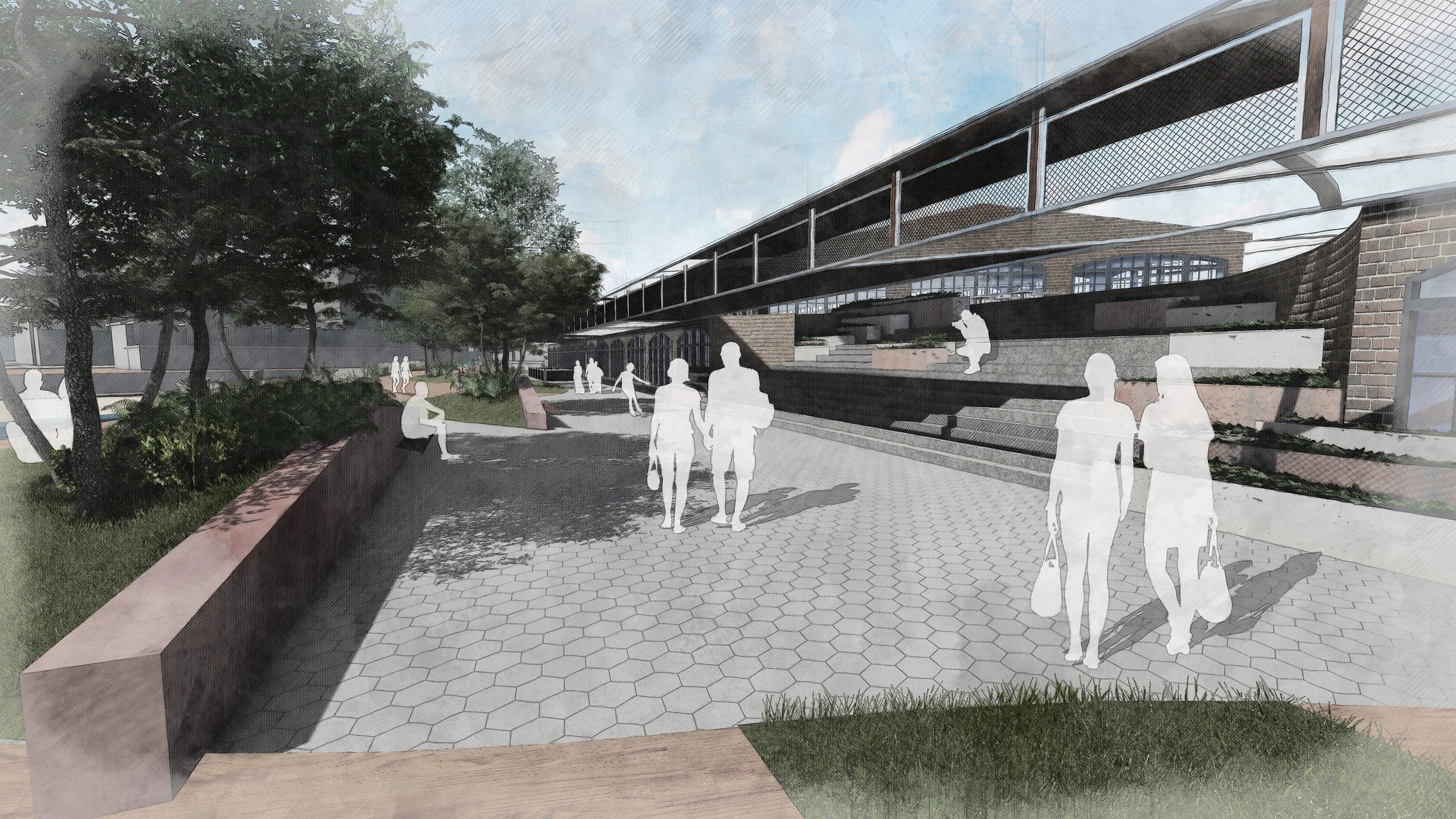
Luna pier
3 lines
In the fall semester of 2017, professor Jay Kost asked us to find a space within an existing project (Mission Bay) that interested us the most. He gave us 2 weeks to analyze, research and present a fun renovation of the space. I took this as an opportunity to try out a theory I had been reading about in design. If you talk to a car designer they will tell you about the 3 line theory that applies to car design. Its the idea that when looking at the profile of a car you can define 3 major lines that create its overall form and character.
After determining the functions and driving goals for the pier, I went to work in defining the edges, transitions and boundaries of the site. I did this by drawing 3 bold and contrasting lines through the site. These lines created the spaces and character of the pier.
So what are the three lines? Take a look at the site plan above and see if you cant determine them for yourself. In the site plan below I illustrate the line-work in use.
The above image emphasizes the 3 lines within the siteplan.
Dark Blue: Serpentine line, starting gradual and growing in curvature as visitors venture further into the site. Also intersects the the structure and blurs the line between architecture and Landscape.
Magenta: Horizontal lines, suggests movement through the site and along the pier. Gives structure and order to the walkway.
Dark Grey: Radial lines, connect, break and give the site a feeling of expansion as visitors venture further into the site. Radial lines also create positive and negative spaces in the architecture which helps dissolve parts of the structure into pedestian spaces.


